2014 Annual USA Climate Review - U.S. Summary
(Source: NOAA's
National Centers for Environmental Information, formally the National Climate Data Center)
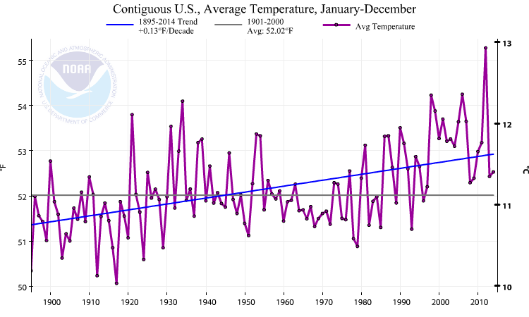
In 2014, the contiguous United States (CONUS) average temperature was 52.6°F, 0.5°F above the 20th century average, and tied with 1977 as the 34th warmest year in the 120-year period of record. 2014 was slightly warmer than 2013 for the CONUS when the annual average temperature was 52.4°F. This marks the 18th consecutive year with an annual average temperature above the 20th century average for the CONUS. The last year with a below-average CONUS temperature was 1996. Since 1895, when national temperature records began, the CONUS has observed an average temperature increase of 0.13°F per decade. Precipitation averaged across the CONUS in 2014 was 30.76 inches, 0.82 inch above the 20th century average. This was the 40th wettest year on record for the CONUS. Over the 120-year period of record, precipitation across the CONUS has increased at an average rate of 0.14 inch per decade. Perspective:
In 1934,
30 US states had temperatures above average with 10 record highs (still)
while 11 were below average. In 2008, 17 states were
below average and 12 were above and no records were set. Source: NOAA
NCDC. To gain the most perspective all available data should be
used to ensure we don't lie with statistics. However, we must consider
the context - for example - that our temperature data start at the end
of the last "Little Ice Age" in the 1800s with the development of thermometers.
Below we use one data set and its calculator (from NOAA NCDC) to present
the full data and then variants as used by warming alarmists and by skeptics.
We use USA data because it is more trustworthy than the global data set.
Analysis: The US temperature has retreated to the 20th century average. It stands at 2 deg F (.9 deg C) below the 1934 high. If we use a 75 year record, we can argue that there is rapid cooling, just as as strongly as those who use a 30 year or 50 year record to promote warming. If the advent of thermometers in the late 1800s had not coincided with the end of the last Little Ice Age, and instead had been during the Medievil Warm Period, there likely would be no evidence of any warming at all.
The projected temperature rise by IPCC is unrealistic, given that the USA and global temperatures have risen by only 1 deg F (.5 C) in 100 years (revised, NOAA, 1 May 2007 ), (or 150 years using the full instrumented data set) during the height of industrial expansion. Even if all this rise is correct, and is attributable to human causes, it is a trivial amount in the natural variation of the Earth, and to suggest the rise would accelerate 5 fold (IPCC best estimate) in this century is incredible. Even after the release of the new data set and procedures by NOAA, which addressed some of the urban heat island issues and dropped the warming 44% (below IPCC 2007), significant other urban heat island issues still remain. There are also issues of calibration as measurement protocols have changed, issues about the design and placement of the temperature stations, and even the strongly held view by many skeptics that this is a natural rise as the Earth recovers from the Little Ice Age (circa 1500-1900).
If the city where you live has a higher temperature than its suburbs, you can imagine the impact of growth around the world on land-based temperatures. The USA has fixed many of these problems. This is likely why the global temperatures rise while those of the USA are more "normal".
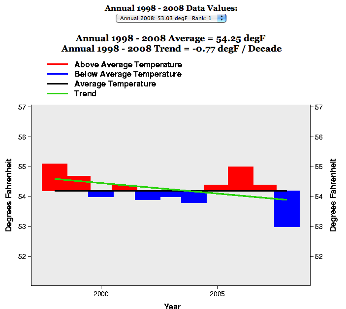
The Climate Skeptics who do not accept the whole argument that mankind is primarily responsible for warming are quick to point out the cooling since 1998 in the presence of continued CO2 growth. NOAA data show a rapidly declining temperature of -0.77 deg F per decade over the last 11 years, with 2008 the coolest year in the series. Here is what the data show.
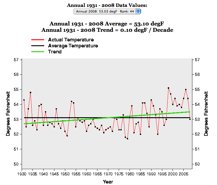
The Climate Skeptics also have a problem with the warm years of the "dust bowl era" being discounted by the alarmists who prefer to start data during cold periods . They ask how the Earth became so hot before CO2 became the curse of mankind. So, if we start our data in the heart of the last recent warm period, here is what the data show. It is still a warming trend line (2009 data are not included yet) but only 1 deg. F (0.55C) per century.
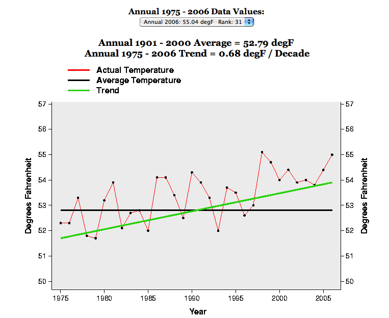
The Warmers who believe mankind is primarily responsible for warming point out the warming since 1975 in the presence of rising CO2 growth is proof of inreasing warmth. They claim that 1975 coincides with new instruments (e.g., satellite-based) and so use that year, one of the coldest in the data set. They then stop the analysis with 2006 data because that is all that have been worked up. It is easy to see why any good scientist, such as many skeptics, would be deeply troubled. Here is what the data show.